BOX PLOTS
A box plot or box and whisker graph as it is alternatively called, is another useful way of visually representing data. They are also useful for identifying extreme values or outliers but their main application is in comparing data distributions. You can still draw box plots manually like you may have done in the past. However it's best to use the technology if it's available. The focus should be on analysing the data provided by the graphs (their features), not drawing them. NZ grapher or iNZight are the likely application programs to be used in 2016. Excel methods are currently quite involved!
CALCULATING 5 NUMBER SUMMARIES FOR MANUAL BOX PLOTS
Create a 5 number summary from the data supplied below. There are an even number of data values in the first example and an odd number of values in the second example. Remember the data has to be in order before you begin!
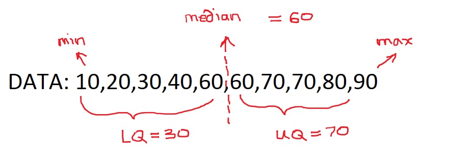
MIN: the lowest value = 10
Lower Quartile (LQ) : the middle number of the lower half = 30
MEDIAN: The middle value of the ordered list = 60
Upper Quartile (UQ): the middle of the upper half = 70
MAX: the maximum value = 90
Lower Quartile (LQ) : the middle number of the lower half = 30
MEDIAN: The middle value of the ordered list = 60
Upper Quartile (UQ): the middle of the upper half = 70
MAX: the maximum value = 90
There is an odd number of values in the second example below.
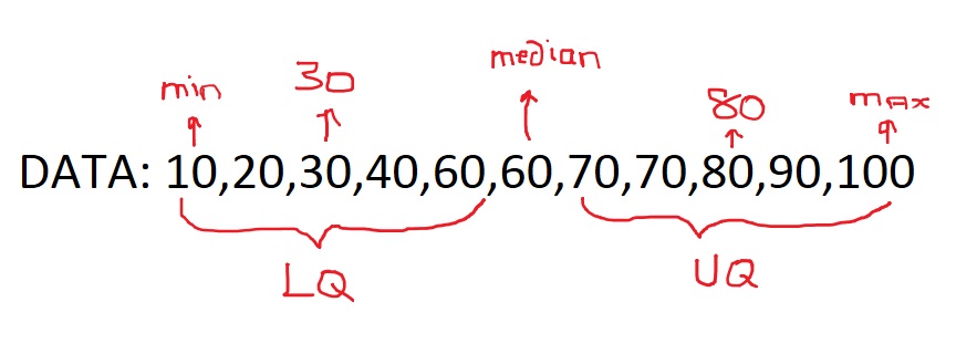
MIN: the lowest value = 10
Lower Quartile (LQ) : the middle number of the lower half = 30
MEDIAN: The middle value of the ordered list = 60
Upper Quartile (UQ): the middle of the upper half = 80
MAX: the maximum value = 100
Finally we make a sketch of the box and whisker against a scale like below. Of course the usual qualities of a graph are expected including a title and labelled axies.
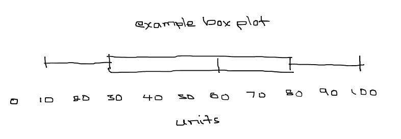
The box part of the box plot is also sometimes referred to in terms of percentiles. The bottom of the box (LQ) is called the 25th percentile, the median is called the 50th percentile and the top of the box (UQ) is called the 75th percentile. So the value of the 25th, 50th and 75th percentiles are 30,60 and 80 respectively. The box is also referred to as the middle 50% as each quartile represents 25%.
DESCRIBE FEATURES OF BOX PLOTS
The main features of graphs are:
Central or median value
The middle 50%, IQR or spread (in other words, the box)
Comparing two graphs:
Shape i.e. symmetry, skewing, bi-modal
Shift - one graph shifted further up the scale than the other
Overlap
Unusual features
A more detailed approach will be found in the Analysis section.
USING TECHNOLOGY
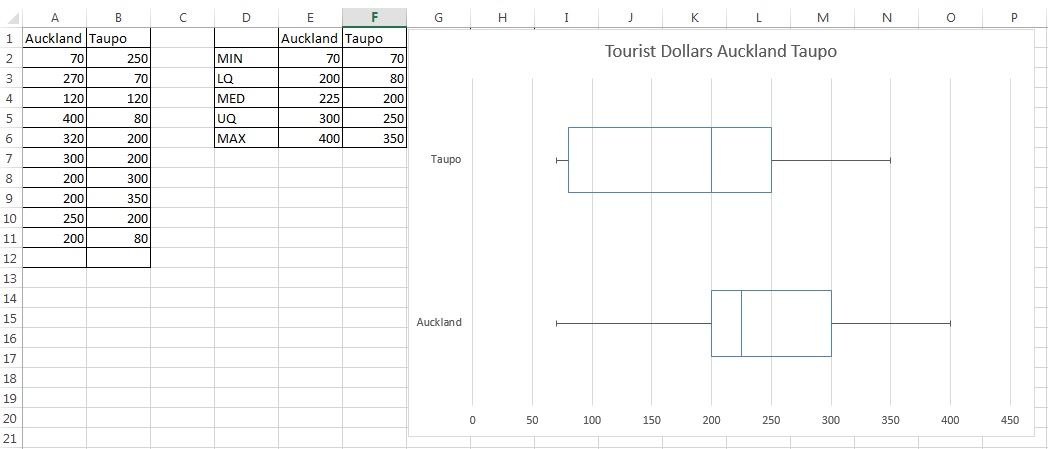
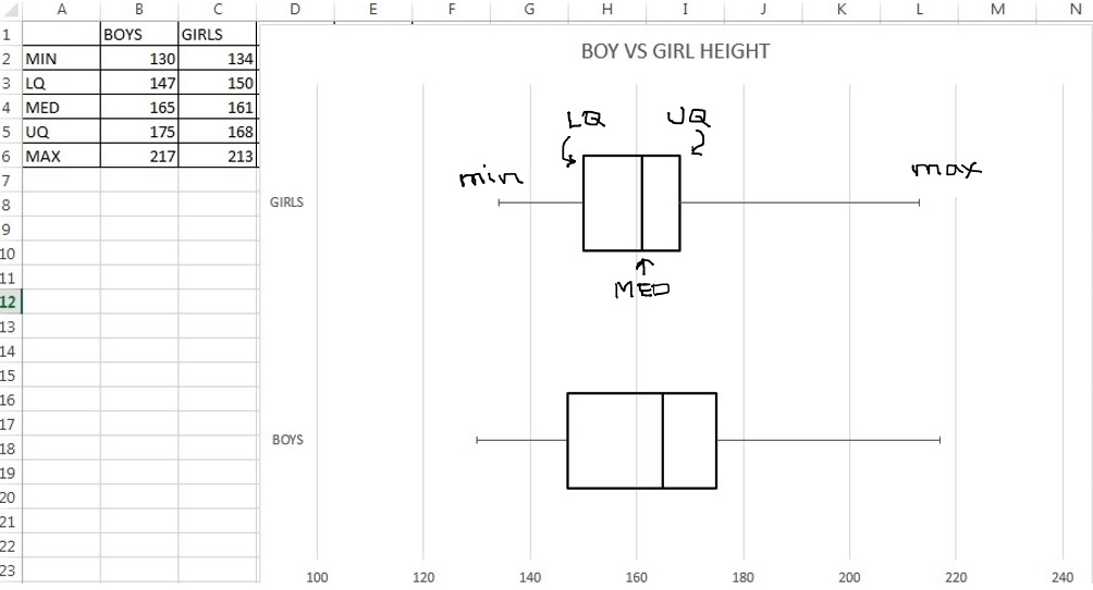
If technology is available the graphs will be drawn using either EXCEL2013 or iNZite. An example using EXCEL is shown below and will be covered in class.
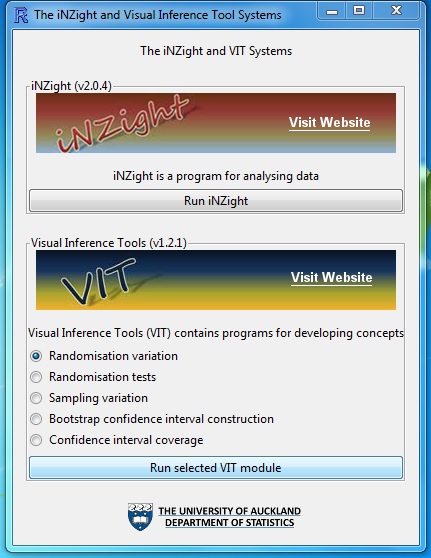
iNZight is another tool used to draw boxplots with. Import the data file and select your variables.
PRACTICE ACTIVITY
This activity is for you to practice your box plots. The data is for tourist dollars spent in Toupo and Auckland. Create 5 number summaries and sketch the box plots.
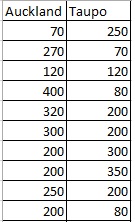
Compare and discuss features of the two tourist areas.