
ACHIEVEMENT EXAMPLE
To get an Achieved grade you still have to show evidence of using each step in the statistical enquiry cycle or PPDAC. The exemplars provided by NZQA don't always show the best way to write a report in the form of PPDAC, but they meet the minimum standard. Have a read of this example for Achieved only. You will notice it is greatly reduced in size from the Excellence example they provided. But it still covers the main points.
In the PROBLEM the investigative question is similar to what you have practiced. The student wants to investigate or compare the median incomes between people who are 'educated' and those who are not. A direct link to the population data would be better. The student also makes a prediction (this adds more interest to the report.)
In the PLAN the student has chosen a sample size of 30 but 50 would have been better. They have used simple random sampling but have not stated why. Neither have they discussed other methods. However, they mention the source of the database they are using.
The DATA has been collected and the 5 number summaries generated for each variable, non-educated and educated. The mean value is not required. But the informal confidence intervals are required for the achieved grade.
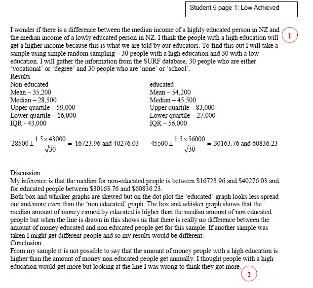
The student begins their discussion or ANALYSIS with their informal confidence interval, putting their calculation into words if you like. They could have said something like - " Looking at my boxplots, I notice that the median income for educated people is higher than the median income for non-educated people, ($45,000 compared with %28,500 respectively)".But they mention that further on in. You have to compare only two features of the distribution of your data for Achieved, like the middle 50% or IQR (for the spread), skewing or shift etc. The student has compared the medians, noticed skewing but not said if it is left or right. I would only mention the dot plot if it added anything further to the inference.
Finally, the student states that if another sample was taken they might get different people and therefore different results - a very minimal statement at that.
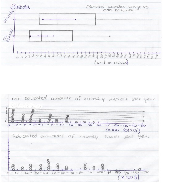
Both graphs have titles and are easy to read - no high tech graphics here
